


Aerospace and Defence Engineering Services
X-Band Synthesizer Application
B2B Product
The X-Band Synthesizer application is designed to control and manage synthesizer devices that send and receive radio signals in defense environments. This application allows users to operate and test devices by generating waveforms, synthesizing frequencies, and monitoring device performance—its primary function. We assisted Mistral in addressing and resolving usability issues encountered while using the application.
Product Type
Application Redesign
Device
Desktop
My Role
UX Designer
Year
2018
About Mistral
Mistral is a certified technology design and systems engineering company providing end-to-end solutions for product design and application deployment. Mistral concentrates on three business domains: product engineering services, aerospace & defense, and homeland security. Mistral is an R&D center recognized by the Department of Science and Technology, Govt. of India, and certified by CEMILAC for design, testing, and validation of defense electronics.

Challenge
We were tasked with redesigning the application to deliver an excellent user experience and an attractive user interface. Our goal was to create a visually appealing design that would stand out. Below are the challenges we encountered while developing the new user interface:
-
The design needed to be intuitive, easy to use, and provide an error-free experience.
-
Navigation had to be simple, easy to learn, and actionable.
-
Visual cues had to be relevant and appropriate to each function and feed.
-
The design needed to be aesthetic, minimal, and pleasing to capture the user’s attention.
Old UI Design
When we did the Heuristic Evalution on the existing design, the following key factors were found not matching the stakeholders mental model.
-
It was not intuitive.
-
No associative learning was provided.
-
No standard usability was practised.
-
No feedback for any interaction between user and the technology.
-
Not contemporary.
-
It was jarring at some places and in some places it was inert.


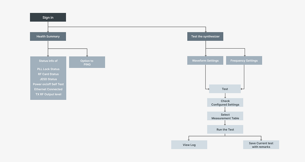
Old Sitemap

Process
In order to identify and define the actual problem, we took step by step process to uncover the areas and issues that everyone may not be aware of. We didn't want to jump into assumptions quickly.
The process that we followed were

1. User Interviews
We interviewed 10 users from different usage perspectives, 6 of whom were testing engineers, the core users of the application. We gained a substantial number of relevant insights that helped us define the optimal user experience.

3. Usability Testing
We didn't rely solely on the core users to draft a solution; rather, we did usability testing with 10 tech-savvy people, giving them context and relevant actions to take in the existing UI designs. Turned out it's not intuitive.

2. Ethnographic Studies
What provides us with real-time insights than an immersive approach? So we did an ethnographic study to better understand users’ challenges and pain points. This enabled us to recommend the right solution for our users.

4. Satisfaction Surveys
Regardless of the insights provided by UAT, we also distributed the results to all testing engineers globally to confirm whether the experience is biased or unanimous, as this issue requires immediate attention.
We interviewed business stakeholders (marketing managers, product managers, deployment managers, and end-user testing engineers) to gather insights on current usability issues, pain points, and their future visions.
The top three most common usability struggles related to their application are as follows:
-
Users are uncertain about what to do next or what will happen next.
-
No proper feedback, either actionable or static, was received after important calls to action.
-
It's not user-friendly for the testing engineers, especially, as they feel disrupted rather than engaged with the application.
Based on these issues, we created assumptions about why users behave in certain ways and then began crafting questions for stakeholders and vendors to confirm whether our assumptions were accurate.
The questions we asked include the following:
-
Does the X-Band Synthesiser stand out compared to your other option? What information do you need to be convinced that the X-band synthesiser is better?
-
When and how do you use the X-band synthesiser when you are testing?
-
What do you expect more of? Speed? Feedback? Or an intuitive user interface?
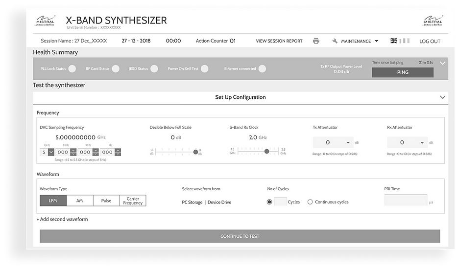
Wireframe
Landing Screen
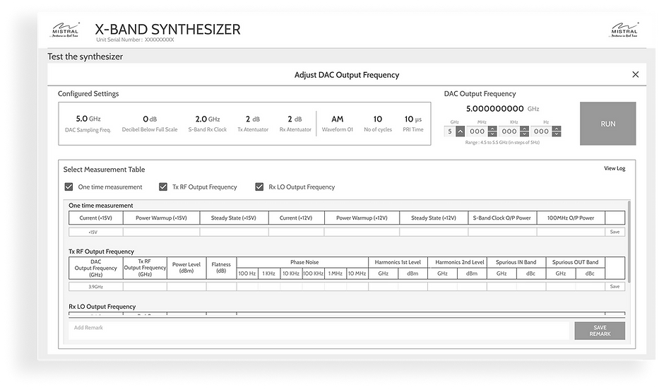
Test Screen
Health Summary Screen

Solution
Opportunities we discovered during the process (only listing a few that stood out):
-
Instead of navigating between three persistent tabs, all three can be brought to a single screen for effortless task commencement.
-
Make ping functionality primary and visible to the user.
-
Simple configuration steps involving waveform generation and frequency settings.
-
Feasibility to view logs for current session tests.

New UI Design

Total Tenure
4 Months, Oct 2018 - Jan 2019
Designed for
Progressive Web App | Android & Windows OS
Created
Design System and Documentation
 |  |
|---|